So you are looking at numbers everyday. These can be in excel sheets / google sheets while cleaning data or trying to get some insights out of the tables in various dashboards you see daily. These numbers might be currency , rates or just volume of any metrics you want to track.
So how would you find the outliers across these tables, the best peforming KPI’s , correlations between various metrics. Just numbers in these tables wouldnt help the user in identifying these underlying relationships.Below are a few ways you can do these in google sheets or tables using R.
Using R
We can also do a similar kind of visualization for tables with numbers using mutiple options. A few of them would be using libraries like DT,Reactable and pivot table js.
DT
This is one of the first packages I started using while trying to publish tables in R shiny apps.The plugins and the extensions in this library makes it easy to copy, filter and searchd data in the tables easy.This package has multiple options to format the values in tables , single rows, bar chart formatting and color scale formatting. Below are the examples of how each formatting option looks like.
For more details regarding how to visualize the tables using DT you can read here
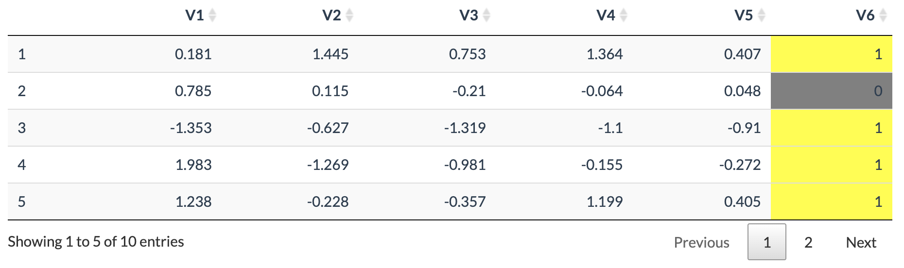
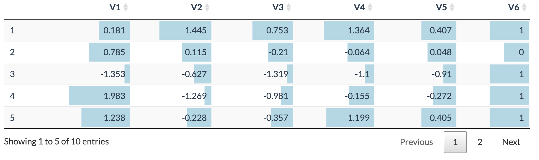
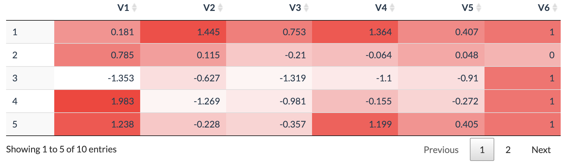
Reactable
Reactable is one of the recent packages in R which I would say have more functionalites than DT above. Apart from conditonally styling the values in the tables it also allows integrations of html widgets which can render sparkline and barcharts in columns.
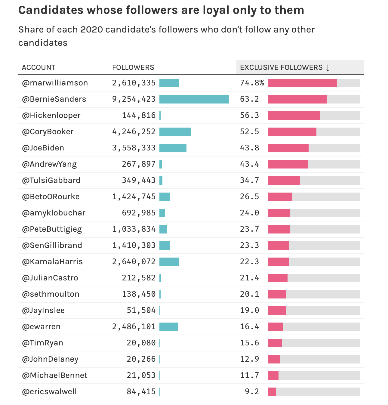
This first example below shows on how to visualize two columns combined together to understand not only which twitter handle has the most users but also who have the most exclusive followers. The visualization makes the top twitter handles standout.
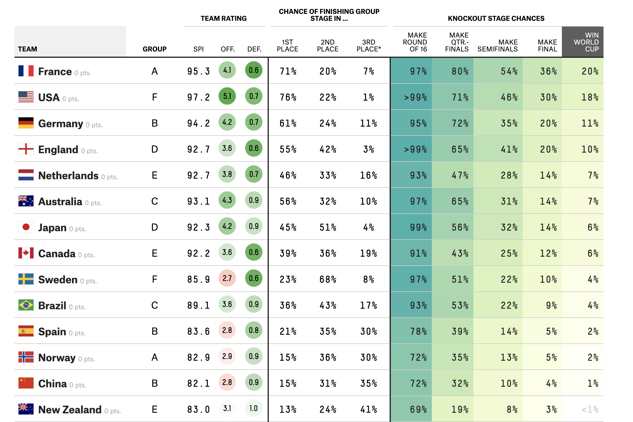
The second table was Women’s soccer world cup prediction which was posted on FiveThirtyEight . This clearly shows how the columns are grouped together and visualized to get a better understanding on how each team does in terms of offense and defense. These columns are colored based off the scores. The knockout stages columns for each team use gradual scaled colors which makes it easy fo the readers to understand which team will progress in the tournament.
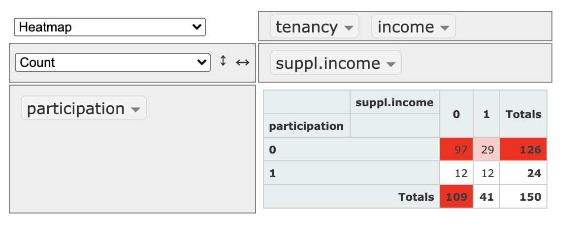
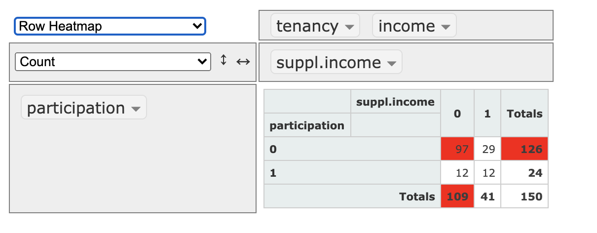
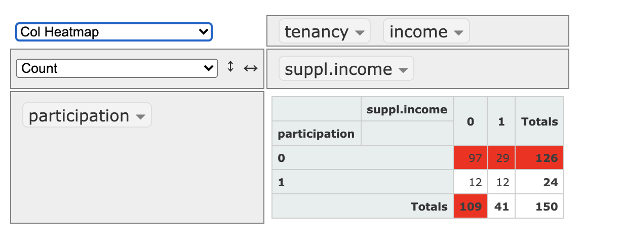
rpivotTable
This R library is based of open source jspivottable. This package has many functionalites such as rendering charts and pivots. In this post we would look at how this allows user to create heatmaps on table . these can be rendered by rows or columns.
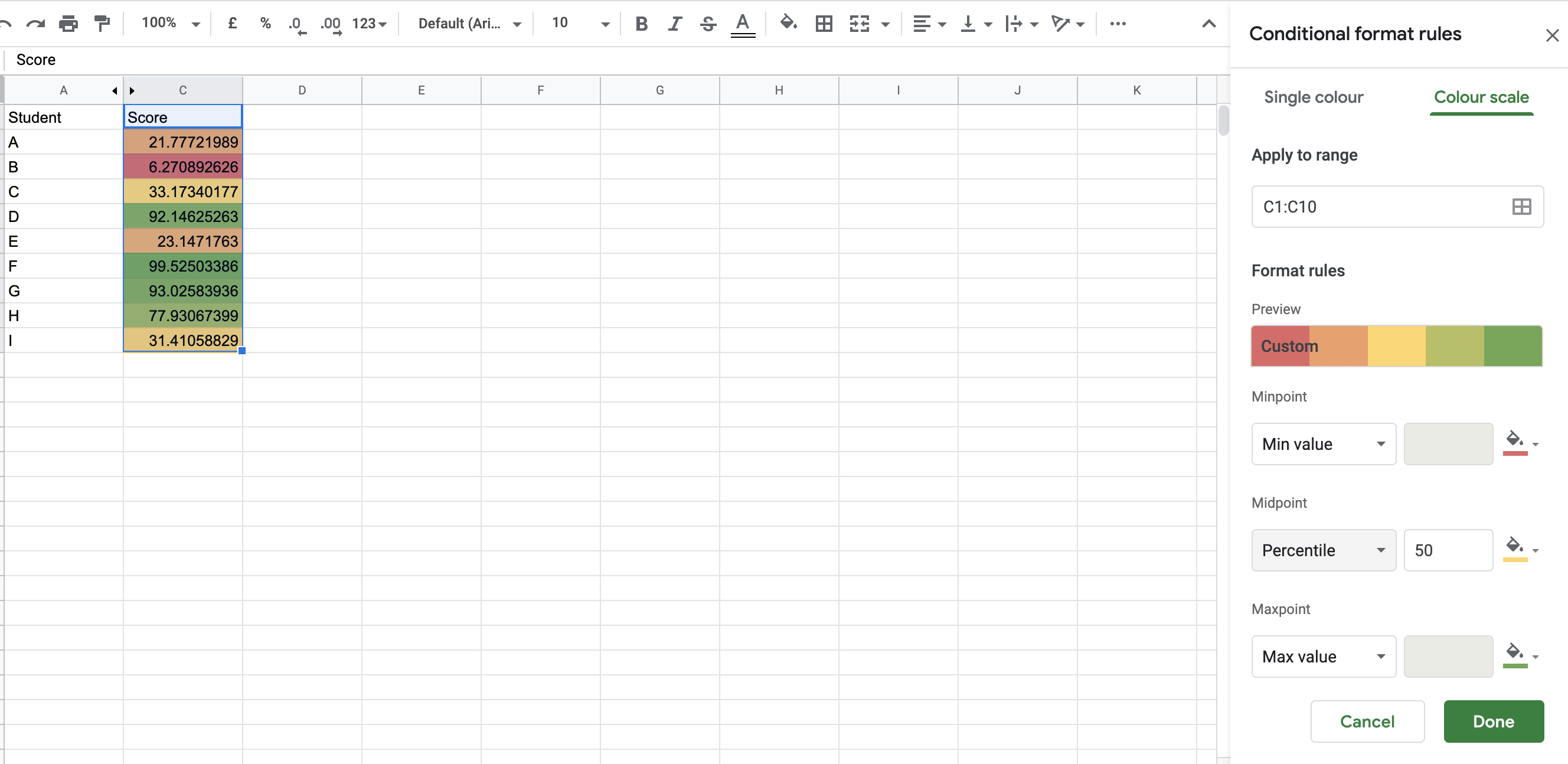
Google Sheets
In google sheets you can do it using the option, conditional formatting . This can be done using single colors or color scale.
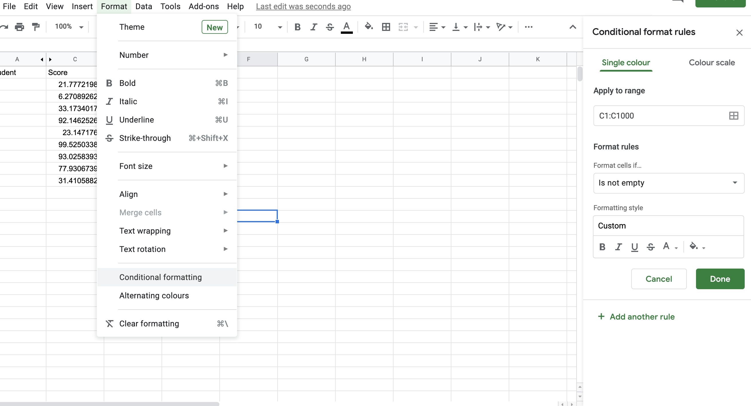
Single color option can be used to format the range you select. This option allows the users to select the colors , add any formulaes like greater than or less than ,vlookups to format the selected range.
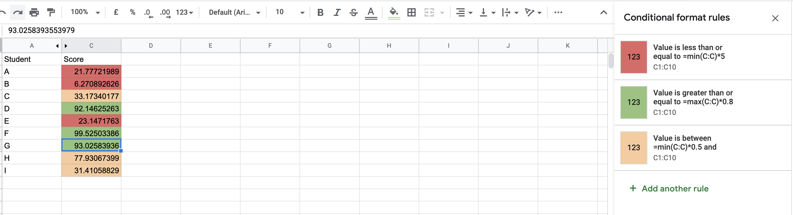
The second option would be to using the color scales. This option can be used when you also want to visually distinguish the difference between the values in the selected range. For example, a score of 90 would be a shade of green, 60 would a shade of orange and 30 would be a shade of red.